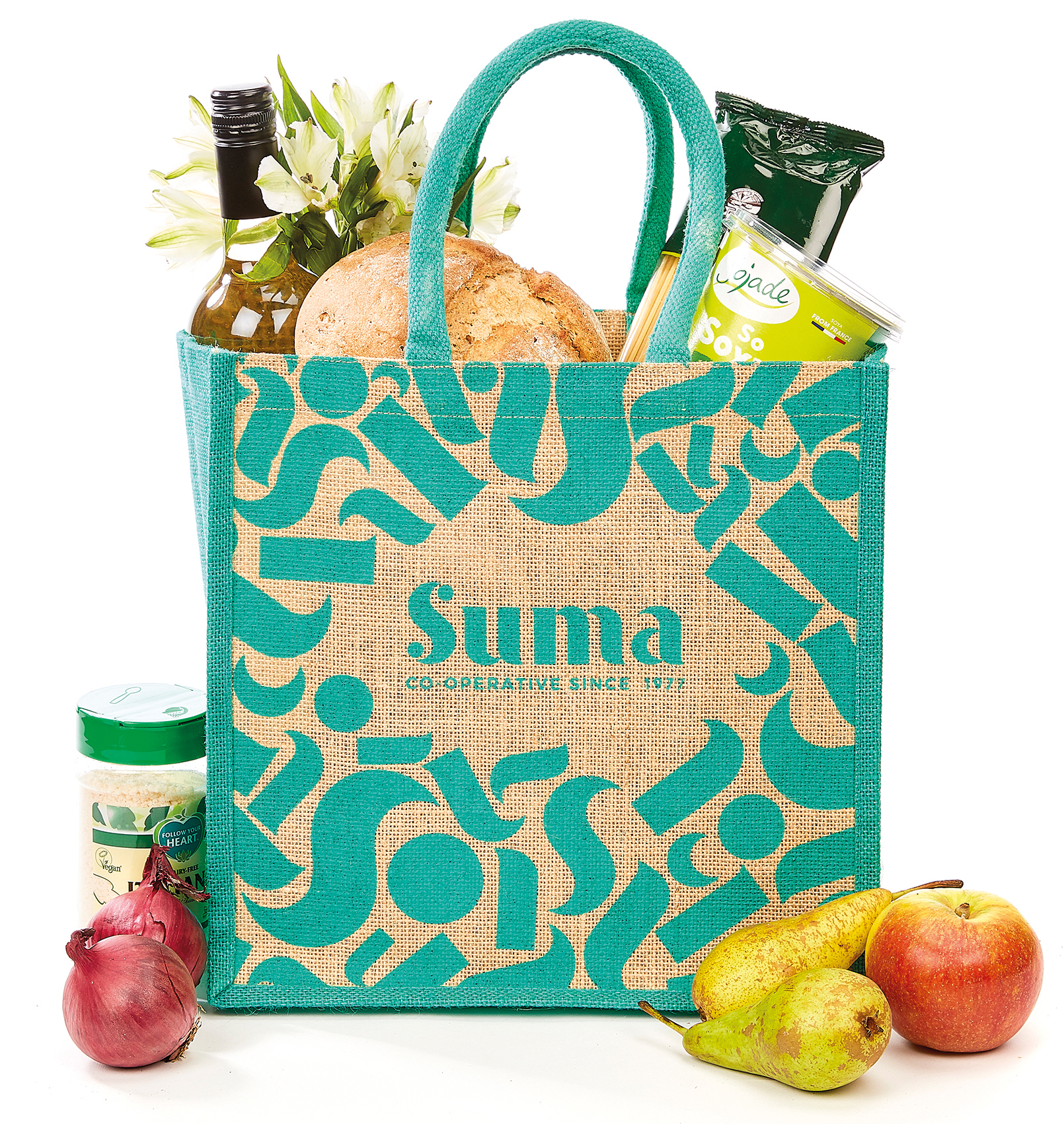
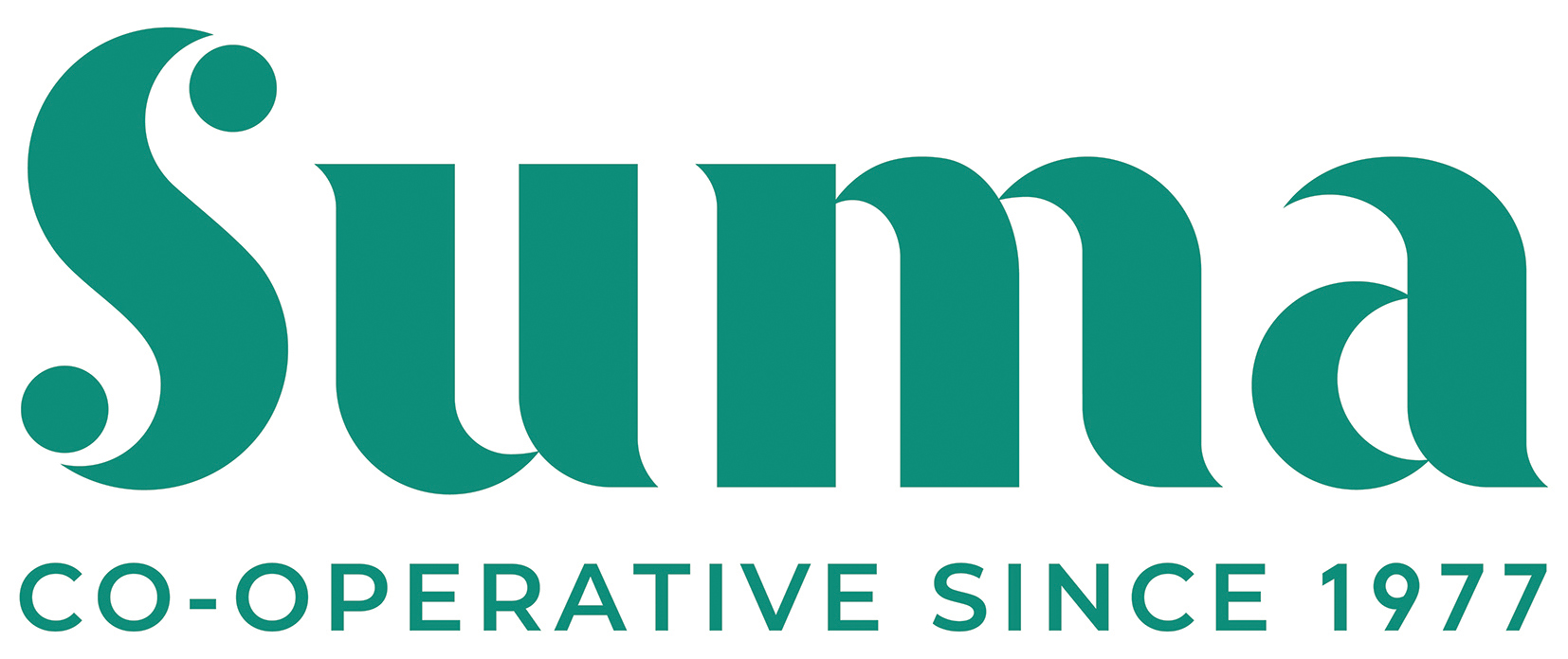
A new look has been unveiled by Suma Wholefoods to freshen up its brand, stress its co-op credentials and create more consistency across its range.
The worker co-op, based in Elland, East Yorkshire, brought in London design agency Pearlfisher to work on its new visual identity after deciding its packaging was not as slick as that of its competitors.
“We’ve not looked holistically at our brand for some time now,” says Suma’s Sheree Hatton. “We’ve been tweaking it here and there as we’ve brought out new products, which means it’s become inconsistent.”
The co-op, which formed in 1977 and now has around 160 worker-owners and annual revenues of about £40m, decided to find a new look after carrying out a brand audit. Consultants from Pearlfisher visited Suma to speak to its customer-facing teams, and to old and new staff, to find out what Suma meant to them and what they thought of its existing branding.

They also spoke to customers for feedback on why they shop with Suma and how their experience could be improved.
“People identified the inconsistency of our design and packaging,” says Ms Hatton. “They were not sure what the leaves or petals in our branding were; there was not as much brand equity in the logo as we expected.”
In response, Pearlfisher came up with a suite of shapes which can be used individually but which also come together to form a logo. The logo itself also features the wording: ‘Co-operative since 1977’.
“They called it ‘sum of our parts’, which fits in with the way Suma works,” Ms Hatton explains. “We work together individually as members and come together as Suma. It’s not too obscure for people not looking for a concept, but for people who are looking for a concept, we can tell them that story.”
The new look also features a short message highlighting Suma’s ethos.
It reads: “We are Suma. A co-operative of ordinary people built on integrity and equality for more than 40 years. We’re committed to sourcing the most delicious and sustainable products, inspiring change for good.”

This refreshes the Suma story for customers, says Ms Hatton, adding a level of consistency. “It will be on every product we launch. We will talk more openly about the provenance of a product, and we will be more open and strong-minded about voicing those ethics.”
Although this aspect of the rebranding emphasises Suma’s worker co-op status, the team opted not to incorporate the Coop Marque, created as an internationally recognised logo for co-operatives. Ms Hatton said the team wanted to keep the new look as clear and simple as possible – and regulations mean Suma already has to include a lot of food-related information on its packaging.
“Our print material and other supporting material will include the Coop Marque,” she said, “But there’s less space on our packaging because there’s other things that we need to have on there – and we want to keep it looking clean.”
Suma is keen for the new look to emphasise its co-op difference as a unique selling point, at a time when supermarkets, multinationals and other rivals from the conventional business sector are developing similar lines, including vegan and gluten-free ranges. “We’re pushing the co-op angle to the fore,” she said. “In our brand audit, not everybody knew we were a co-op, which is a bit embarrassing.”
Hugely EXCITING!
Please share far and wide.
Suma is changing… pic.twitter.com/PyX7YFsCpk
— Suma Wholefoods (@SumaWholefoods) December 14, 2018
Ms Hatton says reaction to the new look has been “very enthusiastic and positive” among the co-op’s worker owners, although the lead up to the launch week (14 Dec) was a very busy one, with branded T shirts and new business cards being handed out, and Suma’s website and social media channels being updated, including the adoption of a new in-house font, Montserrat.
“As we launch people will see the logo changing – we will be doing posts around the new change and the reasons for it. We hope it brings more colour to our shelves and bring more interest as it takes our message back into the high streets. We’ve gone for bringing more colour, making it more modern, to stand out.”
“We work closely with our suppliers so we’ve sent them a press release on this – telling them that they will see us changing, they’ll see the logo changing.”
Although the launch was in mid-December, the rollout will be a gradual process because Suma is keen to keep waste to a bare minimum. “We’re rolling it out on products as we re-order them,” Ms Hatton adds. “People will get our new-look price lists in December, and the logo will be rolled out across our trucks in December and January. January is when we start to see it on products out there.”

