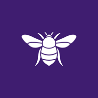
The UK’s Co-operative Party has revealed a new brand identity, which features a fresh logo incorporating a bee.
 With membership at its highest level in modern times, the Party says it aims to reflect renewed ambition while remaining true to values and heritage of the co-operative movement.
The beehive was initially used by the Rochdale Pioneers in the stonework of their first store on Toad Lane, back in 1844. Since then, it has become an emblem of the co-operative ethos. Various co-operative societies across the UK have been using the beehive as a symbol of working together for the common good.
The party’s new branding has already been adopted by dozens of local branches, who have received brand starter packs including a roller banner, tablecloth, membership forms, and a USB stick with templates to print and use.
The rebranding process began in 2018 when the party started working with the agency Soapbox known for its work for Oxfam, the IPPR and Fabians.
Co-operative Party communications and digital officer Ben West explained in a blog post what the new identity represented: “We hope our new look excites and surprises you. But hopefully it also feels a bit familiar. Our new logo incorporates a bee, a symbol long associated with co-operative movement, reminding us of our strength when we work together. The bold fonts, imagery and colours are intended as a modern take our movement’s rich history; practical, campaigning and restless for change.
“And that sense of bold, no-nonsense practicality extends to the roll-out of the new brand. The aim is to make it easy for everyone to use the new brand and to make it their own.”

